Imagine you’ve just invited a high-value prospect to your beautiful new office in Houston. They pull into the parking lot, but there are no signs for the entrance. When they finally find the door, there’s no receptionist—just a hallway with twenty different doors and no labels.
Frustrating, right? They’d probably turn around and leave before you even had a chance to say “hello.”
In the digital world, this happens every single minute. We spend thousands of dollars on beautiful design and SEO, but we forget to act as the “tour guide” for our visitors. If you want a website that actually grows your business, you need to master user flows that convert. For mid-sized businesses with 50 to 5,000 employees, the difference between a “pretty” site and a “high-performing” site is all in the mapping.
As a web developer and designer, I don’t just build pages; I build pathways. Mapping the path is only half the battle; the other half is conversion-focused copywriting that guides the user toward the checkout or contact form without friction. Let’s dive into the psychology and strategy behind creating a frictionless journey for your customers.
The biggest mistake I see in website design and development is the “Everything, Everywhere, All at Once” syndrome. A business wants a user to sign up for the newsletter, download a whitepaper, watch a video, and book a demo—all on the same page.
Psychologically, this creates “Choice Paralysis.” When you give a user too many options, they often choose none. To create user flows that convert, every page must have one primary “North Star” goal.
✦ Wanderer’s Wisdom: You cannot map a path if you don’t know the destination. Before you touch a single line of code, ask yourself: “What is the ONE thing I want the user to do on this page?”
In the UX world, we talk about the “Happy Path.” This is the shortest, most effortless sequence of steps a user can take to reach your goal. For a mid-sized firm, this path usually looks like this:
The Entry Point: They arrive from a LinkedIn post or an SEO-optimized blog.
The Hook: A clear, bold value proposition that answers “What’s in it for me?”
The Proof: Trust signals like client logos or a quick testimonial.
The Action: A high-contrast CTA button that is impossible to miss.
A “Friction Leak” is any point in the journey where the user has to stop and think too hard. According to research by The Baymard Institute, nearly 18% of users abandon a checkout or sign-up process simply because it was too long or complicated.
One of the most common leaks? Confusing website navigation. If your menu is a maze, your user flow is broken. I always recommend a “Navigation Audit” to ensure that your Confusing Website Navigation isn’t the reason your leads are disappearing.
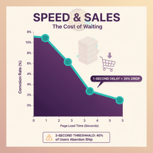
You can have the most beautiful user flow in the world, but if the page takes five seconds to load between steps, the flow is dead. Page speed and sales are inextricably linked.
This is where technical rigor becomes vital. For our partners at Cocha Technology, we ensure that the “pipes” of the website—the hosting, the database, and the cloud infrastructure—are fast enough to support user flows that convert. If your site is sluggish, you aren’t just annoying your users; you’re actively training them to go to your competitor.
The human eye is remarkably easy to lead. We can use “Directional Cues” to subtly push users along the path. This could be an arrow pointing toward a form, or even a photo of a person looking toward your CTA button.
When we use these psychological triggers, we are reducing the “Cognitive Load” on the user. We are making the “Happy Path” the most natural path to follow.
✦ Wanderer’s Wisdom: The best design is invisible. If a user reaches the “Contact Us” page without feeling like they were “sold” to, you’ve mastered the art of the perfect user flow.
For a business with 5,000 employees, a large portion of your B2B leads are likely checking your site on their phones during a commute or between meetings. If your user flow requires tiny clicks or complex typing on a mobile device, it will fail.
Every step in your user flows that convert must be mobile-optimized. This means big buttons, minimal form fields, and ensuring everything is reachable within the Thumb-Test zone. If it’s hard to do with one hand, it’s too hard.
The final secret to user flows that convert is realizing that the work is never “done.” You need to look at the data.
Heatmaps: Use tools like Hotjar to see where people are clicking (and where they aren’t).
Drop-off Reports: Use Google Analytics to see exactly which step in the flow is causing people to leave.
A/B Testing: Try two different versions of a headline or a button color. Sometimes, a tiny change can lead to a massive lift in conversions.
Mapping user flows that convert is about more than just “UX design”—it’s about business strategy. It’s about respecting your visitor’s time and providing them with a clear, authoritative path to a solution.
When you combine the creative storytelling of Wander Web Studio with the technical excellence of a firm like Cocha Technology, you create a digital presence that doesn’t just look good—it performs.
✦ Wanderer’s Wisdom: Don’t build a website that’s a destination; build one that’s a journey. Every click should feel like a step forward, not a turn in a maze.
If you suspect your website is more of a maze than a map, a technical website overhaul can identify where users are dropping off and fix the leaks in your sales funnel. Let’s sit down and look at your “North Star” goals together. We can help you map out the user flows that convert and start turning your traffic into a steady stream of loyal customers.
Through our parent company, Cocha Technology Inc., we are officially multi-certified as: WBE | MBE | SBE | HABE
4321 Kingwood Drive, Suite 222
Kingwood Texas 77339
Phone: 281-607-0616
Email: info@wanderwebstudio.com
Operating on Central Standard Time (CST) | Serving Clients Across All Time Zones
Copyright © Wander Web Studio. All Rights Reserved.